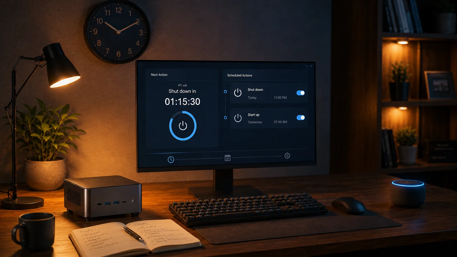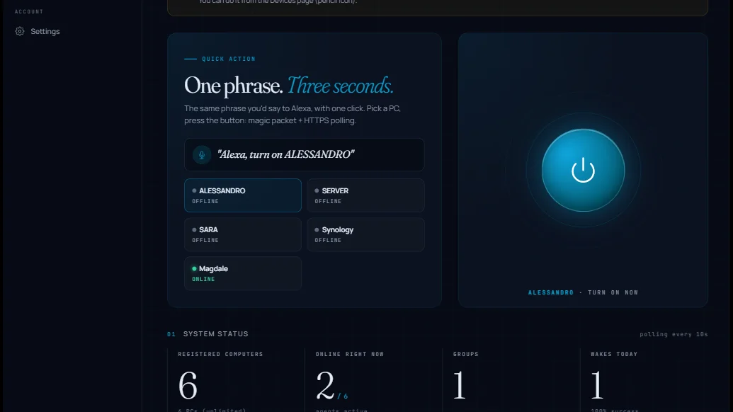
Starting today, opening sayboot.com/app greets you with a completely redesigned webapp. This is not a coat of paint: we rethought every screen from scratch, with one clear idea in mind — the SayBoot dashboard should not feel like "a website with tables in it", it should feel like a tool. A control panel you actually enjoy opening, even just to watch your PCs come alive.
The visual language is that of a technical drawing: a blueprint grid in the background, bright cyan on midnight blue, editorial serif headlines (Fraunces), clean body text (Manrope), and monospace for everything that is "data" — MAC addresses, logs, timestamps. One detail we care about: the fonts are hosted on our own servers, so the new look adds zero requests to external services. Prettier and faster, not prettier and heavier.
Here is the quick tour, screen by screen.
The dashboard: one button, your PC
The heart of the new dashboard is a large radar-style power button: pick a PC and one click turns it on. The color tells you what will happen — cyan when the PC is off (click = power on), red when it is on (click = shutdown, always with a confirmation). Around the button, rings pulse like a radar listening for a signal; below it, the animated voice phrase reminds you of the equivalent Alexa command.
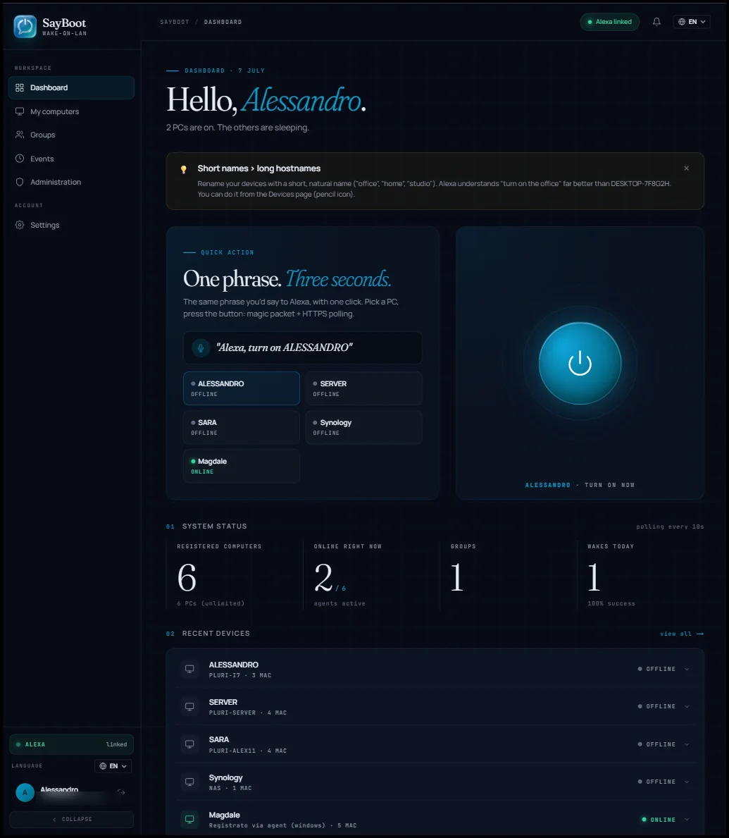
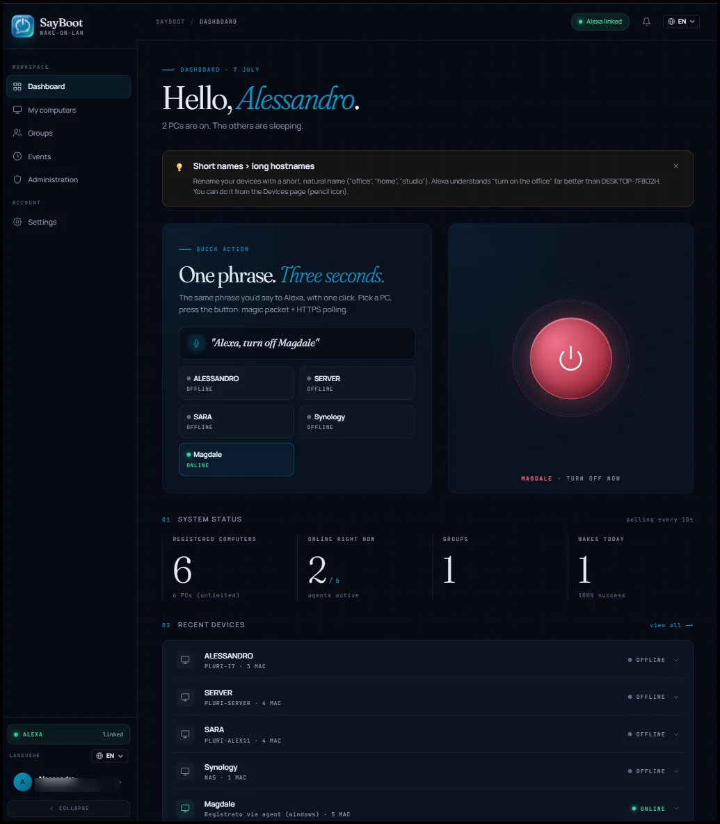
Further down you get editorial-style stats and a terminal-style log with per-level filters: you see what the agent is doing in real time, without opening the events page.
My computers: cards, not rows
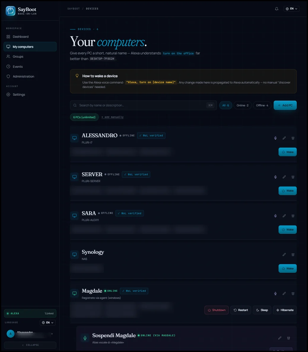
The device list becomes a grid of cards, one per PC, with the online/offline status visible at a glance. If you have many devices, quick search opens with Ctrl-K (Cmd-K on Mac). The "Shut down" button is now red even at rest: color equals action, no ambiguity.
Groups and events
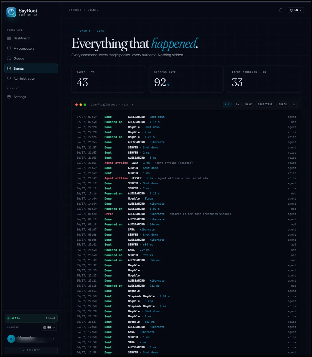
Groups move to cards too, with the same actions as before. The Events page adopts the terminal-style log with level filters and three summary counters at the top, so you can tell at a glance how the week went without scrolling through the history.
Settings in five sections
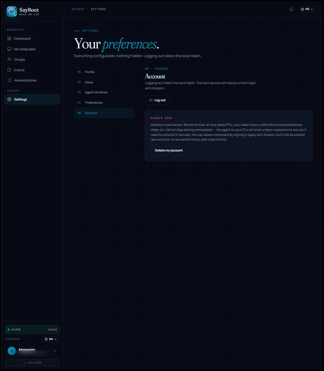
The profile page had grown long. It is now organized into 5 numbered sections with a sticky side navigation that takes you exactly where you need: profile, language, notifications, the new Alexa section (with the skill link status, read-only), and the danger zone for account deletion.
And everything else
The redesign also covers onboarding (now a timeline with editorial numbering), the notification center, the login page, and the public pages, all on the same blueprint background. Most importantly: everything that was there before works exactly as it did. The 6 languages, the plans, the deep links, the confirmations on destructive actions, the GDPR account deletion — no feature was touched, only reclothed.
Try it and tell us what you think
There is nothing you need to do: the new design is already live at sayboot.com/app. If something feels off, less clear than before, or you simply do not like it, write to hello@sayboot.com — the red-button tweak came straight from a user suggestion on release day.
A small favor that makes a difference
We maintain and improve SayBoot in our spare time, with no ads and no investors. If it is useful to you, sharing this article with someone you know — a colleague, a tinkerer friend, a smart-home Telegram group — is the simplest way to support the hours we put into making it better. It takes two clicks, and it means a lot to us. Thank you!